We’re happy to have a guest post today from young and fabulous Kelly Christensen, interior designer/owner of the denver-based design firm, KC Studio. Before you go out and buy that bucket of bold paint to cover your walls, first read Kelly’s tips on picking the best paint colors…
As a designer and artist (I painted with water colors for years before I created homes) you tend to have a keen eye for color. But, even for the most talented, picking paint colors can be tricky and usually a 2 or 3 step process.
I once read that you’ll know if you like a color in the first 3 seconds you see it. I think that’s interesting and only about 90% true, because many times things can grow on you. Like gold…. I think most of us can say 5-7 years ago we wouldn’t have worn gold jewelry or thought of using brass in our interiors, but it’s one of the most popular colors and finishes lately.
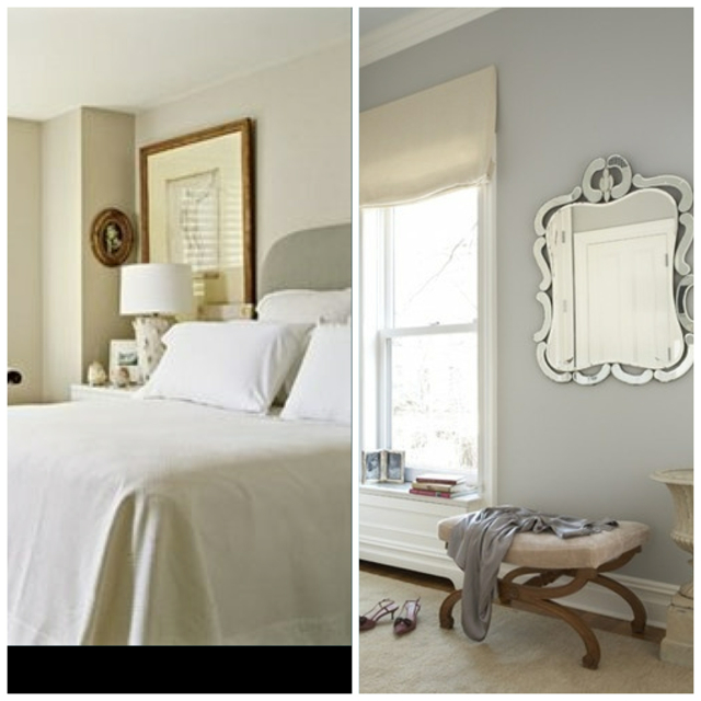
The most asked question as a designer is what paint color to use even when I’ve never seen their space. If they’re not needing a specific color, this can be easy….telling them navy, warm grey, or cream. When they’re wanting something specific, that’s where it gets tricky because the tone of a color changes in every room. For instance, many designers believe Ben. Moore’s Stonington Gray to be the best gray out there…..but look at the difference between these two rooms. The room on the left looks like a warm gray and the room on the right looks like a cool gray. (P.S.- I have still never used this color myself)
Wise words from Barbara Barry, ‘You should always paint a room ten shades lighter than you think, because the color changes throughout the day and darkens in the corners.” The easiest rule of thumb I use (if your’e using Benjamin Moore for example)…. if you like Gray Owl (2137-60) it’s best to actually paint with White Wisp (2137-70). When White Wisp is applied to all four walls of a space, it will actually become Gray Owl (For reference, Gray Owl is one shade darker than White Wisp).
Source: Barbara Barry
I tend to always use the ‘OC’ numbered paint colors with Benjamin Moore. If you were to open a paint can with almost any of these colors, they would first appear white, and then once you’re applying the color, you would still think it’s just white. But when the room is complete and your white trim is up, the color starts to bounce around the space and transform into a hint of color that soothes the senses.
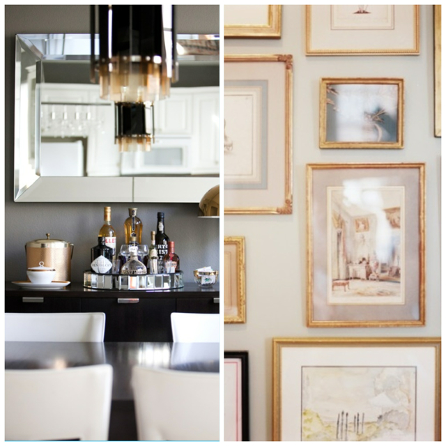
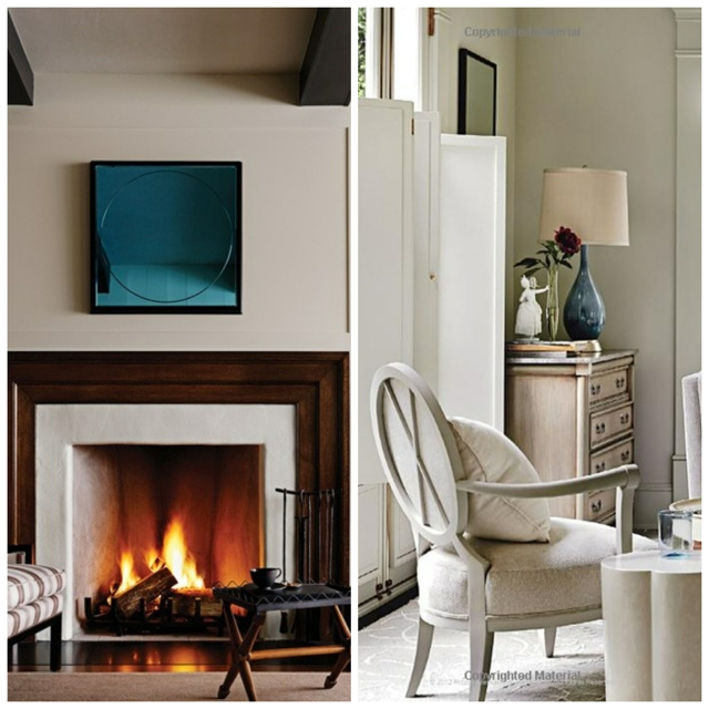
Here are a few of my favorite neutral Benjamin Moore colors that you can try in your next project. I AWALYS suggest getting samples from Guiry’s and tesing a few in different spots around the room, because again, as the light moves around the space, the color will change.
I hope you enjoyed this bit of information! If you’d like to read more from me, please check out my blog http://www.designarounddenver.com/ or follow me on Pinterest. I hope to hear from you soon!
ABOUT KELLY
I grew up in Kansas City, KS and moved to Denver after getting a degree in Interior Design from Colorado State University. I’ve been surrounded by creative people my entire life….my father is a developer, but an architect in another life, and my mother and grandmother are beyond artistic. At the age of 7 I started sewing classes and water color clasess, so I feel like I’ve always been destined to work in this field. I’ve worked with commercial interior design firms and high end residential firms, loving both for different reasons. I love the construction side of projects, but I would never want to be an architect because I have too much passion for colors, fabrics, and textures. After the birth of my daughter Sloane, almost 2 now, I left an amazing design firm to start my own company, KC Studio. It’s been nothing but pure joy, so I obviously was truly meant to be a designer.
{images via Benjamin Moore}


Speak Your Mind