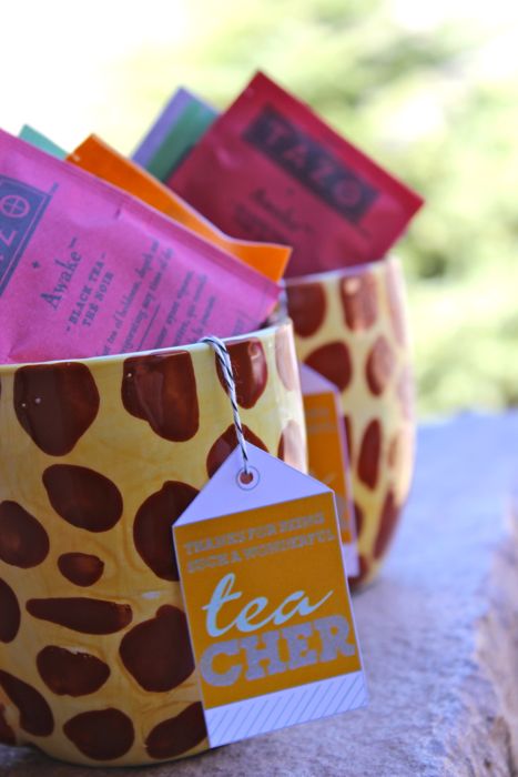
{DIY and FREE PRINTABLE} teacher appreciation


May 7 is Teacher Appreciation day. We all know what a difference teacher’s make in our lives. I will always remember my favorite teacher, Ms. Boll. She was a gift to her students, especially to me.

So, to show the teachers that show up everyday in the classroom for you {or your kids}, we have a fun gift idea for them with a FREE PRINTABLE, designed by Jenna at Fleur de Lis, a paperie {also sells custom designs on etsy here}. Gotta love that.

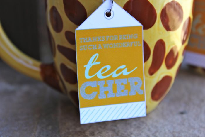
thanks for being a wonderful TEAcher
{get it? For those of you who may be scratching your heads…it’s a mug with tea in it because the word TEA is in TEAcher}

How To:
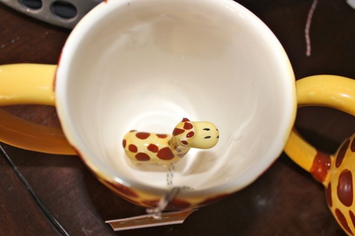
Buy a mug that most represents your child/a particular memory throughout the year {my son chose a giraffe mug from Pier1 because his favorite animal is a giraffe and his teachers most definitely know that}.
PRINT OUR FREE PRINTABLE HERE
Use twine {or any string you have} and hang the string from the inside of the mug with tape, with the tag on the outside of the mug.
Sign your child’s name and year on the bottom of the mug with a Sharpie
Fill the mug with tea bags.

It’s sure to make the teacher recipient smile…and it will serve as a reminder of your special child.
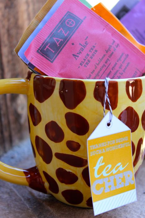
Even if you miss Teacher Appreciation Day on May 7, this makes a great end of the year gift or christmas gift for your child’s teacher too!

Hope you like this enough to PIN IT. And, if you don’t already follow us on Pinterest or Fleur de Lis on Facebook, please do so. You’re sure to learn about more free printables, and be in the ‘fabulous-know.’

{images via Tutto Bella}
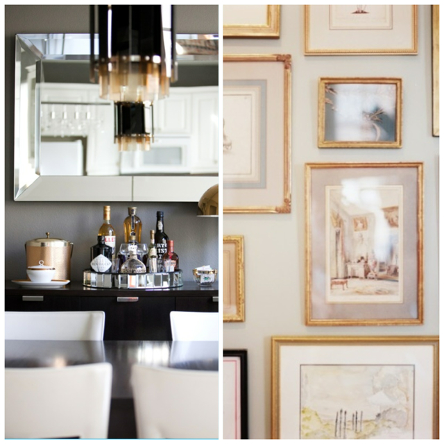
{guest post} kelly christensen, interior designer

We’re happy to have a guest post today from young and fabulous Kelly Christensen, interior designer/owner of the denver-based design firm, KC Studio. Before you go out and buy that bucket of bold paint to cover your walls, first read Kelly’s tips on picking the best paint colors…

As a designer and artist (I painted with water colors for years before I created homes) you tend to have a keen eye for color. But, even for the most talented, picking paint colors can be tricky and usually a 2 or 3 step process.

I once read that you’ll know if you like a color in the first 3 seconds you see it. I think that’s interesting and only about 90% true, because many times things can grow on you.  Like gold…. I think most of us can say 5-7 years ago we wouldn’t have worn gold jewelry or thought of using brass in our interiors, but it’s one of the most popular colors and finishes lately.

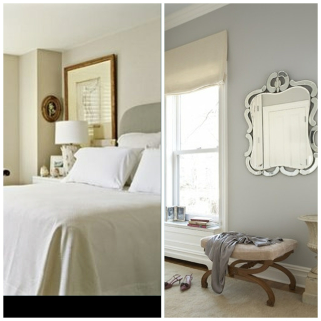
The most asked question as a designer is what paint color to use even when I’ve never seen their space.  If they’re not needing a specific color, this can be easy….telling them navy, warm grey, or cream.  When they’re wanting something specific, that’s where it gets tricky because the tone of a color changes in every room. For instance, many designers believe Ben. Moore’s Stonington Gray to be the best gray out there…..but look at the difference between these two rooms.  The room on the left looks like a warm gray and the room on the right looks like a cool gray.  (P.S.- I have still never used this color myself)

Wise words from Barbara Barry, ‘You should always paint a room ten shades lighter than you think, because the color changes throughout the day and darkens in the corners.”    The easiest rule of thumb I use (if your’e using Benjamin Moore for example)…. if you like Gray Owl (2137-60) it’s best to actually paint with White Wisp (2137-70).  When White Wisp is applied to all four walls of a space, it will actually become Gray Owl (For reference, Gray Owl is one shade darker than White Wisp).

Source: Barbara Barry

I tend to always use the ‘OC’ numbered paint colors with Benjamin Moore.  If you were to open a paint can with almost any of these colors, they would first appear white, and then once you’re applying the color, you would still think it’s just white.  But when the room is complete and your white trim is up, the color starts to bounce around the space and transform into a hint of color that soothes the senses.

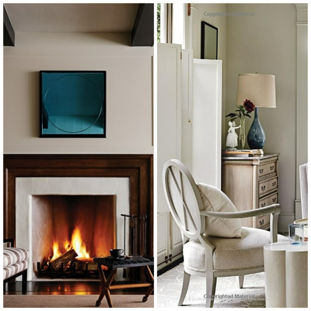
Here are a few of my favorite neutral Benjamin Moore colors that you can try in your next project. I AWALYS suggest getting samples from Guiry’s and tesing a few in different spots around the room, because again, as the light moves around the space, the color will change.

I hope you enjoyed this bit of information!  If you’d like to read more from me, please check out my blog http://www.designarounddenver.com/ or follow me on Pinterest.  I hope to hear from you soon!

ABOUT KELLY
I grew up in Kansas City, KS and moved to Denver after getting a degree in Interior Design from Colorado State University.  I’ve been surrounded by creative people my entire life….my father is a developer, but an architect in another life, and my mother and grandmother are beyond artistic.  At the age of 7 I started sewing classes and water color clasess, so I feel like I’ve always been destined to work in this field.  I’ve worked with commercial interior design firms and high end residential firms, loving both for different reasons.  I love the construction side of projects, but I would never want to be an architect because I have too much passion for colors, fabrics, and textures.  After the birth of my daughter Sloane, almost 2 now, I left an amazing design firm to start my own company, KC Studio.  It’s been nothing but pure joy, so I obviously was truly meant to be a designer.

{images via Benjamin Moore}

upcycle mania

So sorry we’ve been MIA. Goodness, it seems we took a 3 week spring break. Between birthdays, vacation, kiddos and work, we haven’t had a chance to sit at the computer at all.

In honor of Earth Day today, we are sharing a few upcycle DIY projects that make re-using old things in a new way just, well…fabulous. And the best part…the only energy it takes is from you. If you’ve done any cool upcycling yourself lately, please send us photos…

Upcycled Ladder with Shelves, Less Than Perfect Life with Bliss


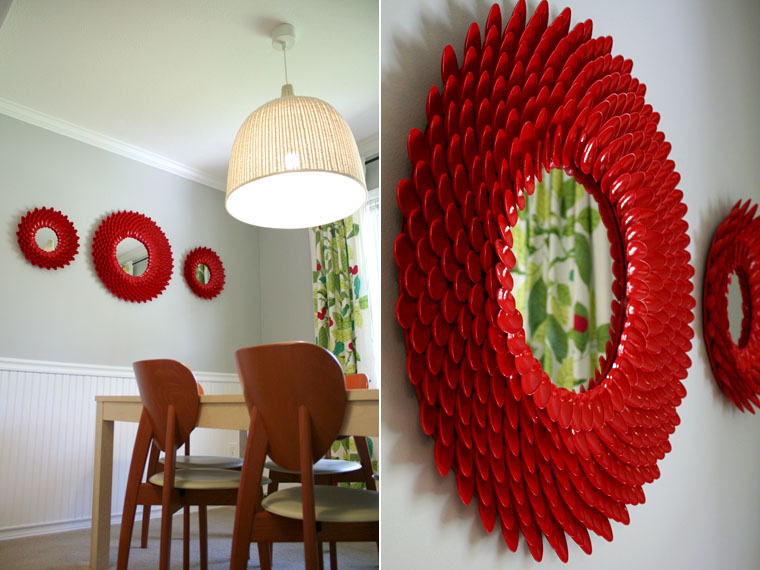
Plastic Spoon Mirror, Little Things Bring Smiles

Frame Corner Ceiling, Michael Stravato for the New York Times

Suitcase Side Table, Cupcake and Cashmere

Ski Lift Swing, Colorado Weddings Magazine
I don’t like to ski, but I could so do this

Hanging Rainboots Planters, Rosy Posy

 Upcycled Can Vase, Apartment Therapy

Leather and Wood Shelf, Design Sponge

Record Side Table, The Flourishing Abode

{images via Less Than Perfect Life with Bliss, Little Things Bring Smiles, The New York Times, Cupcakes and Cashmere, Colorado Weddings Magazine, Rosy Posy, Apartment Therapy, Design Sponge, The Flourishing Abode}

uncooked cards

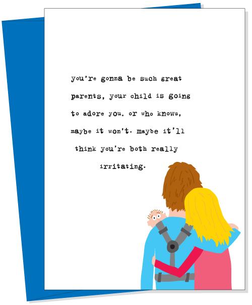
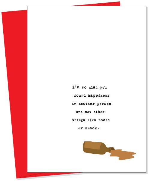
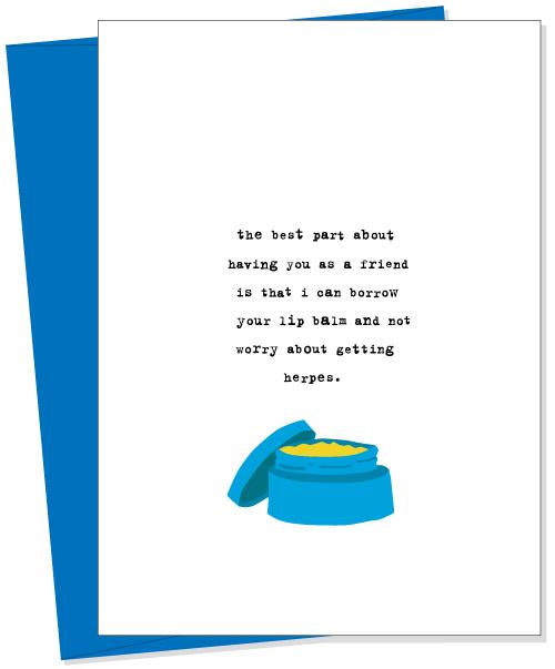
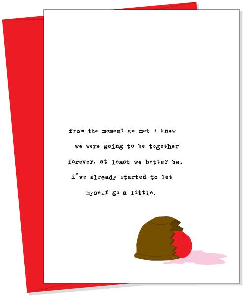
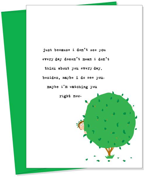
Being a part of the fabulous Fleur de Lis (a paperie) family, you can guess I have seen my fair share of greeting cards. Personally, I am a huge fan of the quirky, weird, sarcastic cards. The ones that you’ve never seen before… the ones that cause you to turn heads in the store because you can’t stop laughing.

 Uncooked greeting cards are just that. And, they are absolutely hilarious. Seriously, if you’re ever having a bad day and need a good laugh, visit their website and read their cards… I guarantee your spirits will be boosted.

If you’re interested in purchasing any, because we all know somebody who would get a kick out of them, go to Fleur de Lis!
{I make sure we are fully stocked with them at all times!}

Here are a few of my favs… hope you get a good laugh!
{if not, don’t judge me on my humor :-)}

{images via Uncooked}


DIY Crayon Flower Art

Crayon art is everywhere this year, so on a snowy Colorado day, while the kids and I were stuck inside, I brought out the box of crayons. The kids were busy making hearts and dinosaurs {for the kids, we used the standard method, inspired by my friend, Devon, who was also stuck inside with her kiddos for the day}, which included wax paper, shredded crayons, a towel and an iron.

When the kids went down for a nap, while I was cleaning up, an idea popped into my head. And when an idea pops into a DIY-addicts head, there’s bound to be another project…and a mess. The result, melted poppy crayon art.

Melted Poppies

Ingredients:

Wax paper
green crayon
red and yellow crayon shreds
modge podge
griddle
battery powered candles
glass vases/hurricanes

 How to:

Shred the crayons you want to use for the flower color. I used 1 yellow crayon and 2 red crayons. I didn’t find a cheese grater to be effective, so I used a pencil sharpener, and it worked great.

Cut the wax paper to the size of the vases {wrap the wax paper around the vase and leave just an inch or two extra space to overlap – this will be the area where you add the modge podge}.

Turn the griddle on low.

NOTE: You must work with quick hands for the next step.

Have the green crayon {to use for the stems and grass} and the crayon shreds ready and accessible because you will need to work quickly.

Place the wax paper on the griddle and immediately draw the grass and the stems freehand.

Quickly, place the center of the flower on each stem with yellow shreds, then immediately grab the red crayon shreds and add around the center of the flower. Don’t pile on the shreds too thick – a small amount is enough.

Once all the shreds are melted, which will take about 5 seconds or so, gently slide the wax paper off the griddle {don’t pull the paper up, or the flower will melt into each other}

Immediately place tightly around the vase {if you wait too long, the crayons will harden and then will crack/break when you curve the paper around the vase}.

Add modge podge to the end of one side of the wax paper and seal.

Add the candles to the vase and you have a lovely, DIY spring centerpiece.
 

Happy Spring!

{images via Tutto Bella}